Japan starts building the world’s largest floating solar farm

Leave a Comment

About 50 kilometres from the high rises and densely-packed streets of Tokyo, crews have begun work on a marine platform that will soon house the world’s largest floating solar installation.

Under development by electronics and Ceramics Company, Kyocera Corp., the project includes nearly 51,000 solar modules that will cover 180,000 square-metres of a reservoir above Yamakura Dam in Chiba Prefecture, Japan. When completed, the solar farm will pump 13.7 megawatts of power into the land-strapped Asian country’s electricity grid.

With less than half the land mass of the province of Ontario and a population of more than 125 million, water-based solar farms are the latest in a long list of inventive schemes Japanese engineers have developed to boost the country’s renewable energy footprint.

Meanwhile, the newest addition to the country’s renewable fleet builds on the technology of other floating solar plants already operating on the Japanese islands. Kyocera has developed a track record of building the niche plants, commissioning two similar but significantly smaller projects last year.

“With the decrease in tracts of land suitable for utility-scale solar power plants in Japan due to the rapid implementation of solar power, Kyocera TCL Solar has been developing floating solar power plants since 2014, which utilize Japan’s abundant water surfaces of reservoirs for agricultural and flood-control purposes,” the company said.

The new project on Yamakura Dam reservoir is expected to produce 16,170 Mwh per year, enough to power approximately 5,000 households.

The project will be managed by the Public Enterprises Agency of Chiba Prefecture and is scheduled to be commissioned in 2018.

How To Remove "Showing Posts With Label" From Blogger

Leave a Comment

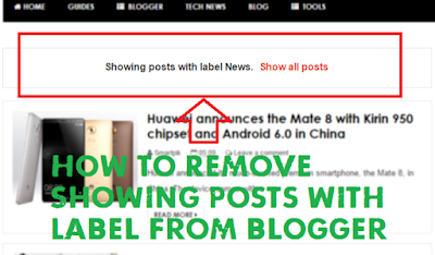
When you hit search from blogger search box a status message shown "Showing Posts with The Label XYZ show all posts". Sometimes this message may be different according to different templates.

Some people do not want to show this message on their blog and want to remove this message from their blog. Here in this article you will learn how to remove this message from your blogger blog.

All you have to do that just go to your blogger dashboard and click on "Template" then Edit.

Now Press CTRL+F and find this code:
<b:includable id='status-message'>
After finding the above code you will see the complete code like below:
<b:includable id='status-message'>
<b:if cond='data:navMessage'>
<div class='status-msg-wrap'>
<div class='status-msg-body'>
<data:navMessage/>
</div>
<div class='status-msg-border'>
<div class='status-msg-bg'>
<div class='status-msg-hidden'><data:navMessage/></div>
</div>
</div>
</div>
<div style='clear: both;'/>
</b:if>
</b:includable>
After Finding above Code Replace it with the below code.
<b:includable id='status-message'>
 <b:if cond='data:navMessage'>
<div>
</div>
 <div style='clear: both;'/>
 </b:if>
</b:includable>
Save your Template. And that's it! If you need any help, leave a comment below. Don't forget to Share.Thank you!

How to Host your Websites on Google Drive

Leave a Comment

If you are looking for a free website hosting either for permanently or temporarily, then Google drive is the best choice for those who does not want to spend a penny for web hosting.

You can host any files (JavaScript, CSS, and Images etc.) on google drive server but can't host PHP.

How to Host: Those who wants free hosting then follow the following simple steps:

Step1:
First, You have to create all necessary files (CSS, Index and Images). Then,  Log in to your Google Drive account.

Step2:
Create a Folder as 'website'. Now, open the folder (website) and upload all files.

Step3:
Now, Right click on the folder ( my website ) and then 'Share'.


Step4:
Now, Click on 'Advanced'.


Step5:                       
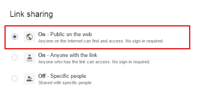
Now, Click on 'Change' and then change the sharing option to public and save the changes.


Step6:
And then, copy the URL address of the folder and keep in Notepad.
                           

Step7:
Now, Your URL address something look like below,
https://drive.google.com/folderview?id=0B-AYvC9Y1riabVdVZlk4Vy1NQTQ&usp=sharing
The File id is highlighted in red color.

Step8:
Now, we have to make some changes to host files. And replace red color section in below URL by your file id.
http://googledrive.com/host/file-id
Step9:
After making changes, URL will something like below,
http://googledrive.com/host/0B-AYvC9Y1riabVdVZlk4Vy1NQTQ
Now, Copy and Paste the URL on the browser address bar and hit 'Enter'. done. Your site now running free on the internet using google drive at free of cost.

The URL address of the hosted website is too long, then you can short your URL by any URL shortener site or redirected the site using a custom domain name.

How To Find CNAME Record Of Blogger Blog Again For Custom Domain

Leave a Comment
If you are going to install a custom domain name for you blogger blog, then the CNAME record is essential for that job. To redirect your blog to the custom domain it’s required to mentions the CNAME entries in the domain registrar system account. Put the entries inside and your domain registrar takes some times to redirect your blog completely to the new custom domain. It’s easy to find the entries first time inside the blogger but what if you want it again inside the blogger.

How to Get CNAME Records in Blogger First Time:

To find the CNAME record first time Just move to the Blogger blog and inside the settings section >> go to basic, you'll find the Publishing options where you find the hosted account URL and here you can place the third party URL for your blog or website. Add you’re purchased Domain in place of the blogger hosted domain and click on the Save Button now you are prompted with the two CNAME entries. First CNAME record is default for all and second is separate for all. Which looks like below.
Host                                 
Points To
www   
ghs.google.com
id3xqjmeuhma
gv-garzfrgu37ubfb.dv.googlehosted.com
First is common for all and second CNAME record is different from users to users. You can use both the entries in your domain provider user account and enter two CNAME records inside and it'll takes some time to completely redirect the blogger hosted domain to the custom domain.

But what if your second CNAME Entry gets deleted accidentally? How do we get it again? Follow the easy guide below to get the Second CNAME record again.

Find CNAME Record of Blog Second Time:

If you lost the CNAME records of your blog or website then left all your worries. You can get it back. First CNAME record as mentioned before is default to all blogger BlogSpot account and now you only needs second CNAME record. You can get it in the Webmasters Account. Go to the GoogleWebmasters Verification Tool and here you will find the list of the sites verified. Head over to the site which you want to find the details Click on Verification.
It'll shows you the second DNS CNAME record with Host and Points to address. Copy the Address which you got and paste it back to the domain provider account. It'll make it easier for domain registrar to locate the website or blog again.

Hope you successfully get and managed the Second CNAME record of your Blog. 
Thank You!

Star Rating Effect For Blogger Popular Posts

Leave a Comment

Friends, Today I am going to share a trick to add Star Rating effect into blogger popular posts widget using font awesome.

Adding this effect to your blogger popular posts widget makes some additional benefits. It makes your popular posts more attractive. After adding this effect it's look like a WordPress plugin. The WordPress plugin are providing user rating and that rating will show on the bottom of popular posts list, but in blogger it’s complicated because there is no internal facilities to add a user rating setup. This effect only display a fixed rating.  It’s simple and you can easily add this effect to your blog.

Well, those who wants to try this trick follow the following simple steps:

As usual Log in to Blogger >> Template >> Edit HTML

This widget uses Font Awesome, please add the following CSS link above </head>
<link href='//maxcdn.bootstrapcdn.com/font-awesome/4.4.0/css/font-awesome.min.css' rel='stylesheet'/>
If the above link already installed, please skip this step.

Now find this code ]]></b:skin> and just above it paste the following code:
/* Popular Post */.PopularPosts ul{background:#fff;list-style:none;margin:0;padding:5px 5px 0;overflow:hidden;border-top:none}.PopularPosts li,.PopularPosts li img,.PopularPosts li a,.PopularPosts li a img{margin:0;padding:0;list-style:none;border:none;background:none;outline:none}.PopularPosts ul{margin:0;list-style:none;color:#64707a}.PopularPosts ul li img{background:#fafafa;display:block;margin:0 10px 0 0;width:60px;height:60px;overflow:hidden;float:left;}.PopularPosts ul li{position:relative;background-color:#fff;margin:0;padding:.7em 0!important;border:0;position:relative;border-bottom:1px dotted rgba(0,0,0,0.2)}.PopularPosts ul li:before{font-family:fontawesome;content:'\f005\f005';display:inline-block;position:absolute;color:#f39c12;text-align:center;bottom:0;right:0;margin:9px 0;font-size:11px;padding:0;font-weight:normal;line-height:normal;transition:all .3s}.PopularPosts ul li:nth-child(1):before{font-family:fontawesome;content:'\f005\f005\f005\f005\f005';}.PopularPosts ul li:nth-child(2):before{font-family:fontawesome;content:'\f005\f005\f005\f005\f006';opacity:.9}.PopularPosts ul li:nth-child(3):before{font-family:fontawesome;content:'\f005\f005\f005\f006\f006';opacity:.85}.PopularPosts ul li:nth-child(4):before{font-family:fontawesome;content:'\f005\f005\f006\f006\f006';opacity:.8}.PopularPosts ul li:nth-child(5):before{font-family:fontawesome;content:'\f005\f006\f006\f006\f006';opacity:.75}.PopularPosts ul li:hover:before{opacity:1}.PopularPosts ul li:first-child{border-top:none}.PopularPosts ul li:last-child{border-bottom:none}.PopularPosts ul li .item-title a,.PopularPosts ul li a{color:#333;font-size:13px;}.PopularPosts ul li a:hover{color:#2476e0;}.PopularPosts .item-thumbnail{margin:0;}.PopularPosts .item-snippet{display:none}.PopularPosts .item-title{font-weight:700;padding-bottom:.2em;padding:0 5px}
Save your template and you are done! Visit your blog and you will see the star rating effect under each popular posts. Thank You!

9 Proved Methods To Increase Adsense Revenue

Leave a Comment
Google AdSense is on of the best Contextual Advertising Program, Famous these days and being used by millions of bloggers and webmasters.

Today I gonna tell you how can you increase your AdSense earnings by doing some smart changes in your blogging ways.

9 Proved Methods To Increase Adsense Revenue

AdSense Program Policy: Always Follow the AdSense program policy it will make good effect.Google loves the publisher who strictly follow the google adsense program policies.

Select A Best Niche: Good Niche will generate huge money, As the adsense earnnings totally depends on the money spent on the google adwords to show the particular ads, some niches are more profitable like Health, Insurance, Webhosting.

Keywords Selection and Placement: keywords plays important role to show the high paying ads on your blog. You should find good keywords with High CPC, You can get High CPC keywords through Adwords, Semrush. There are other online tools available in the web which provide the information of high CPC keywords. After Finding good keywords choose the right place on your blog and articles to put these keywords. Title, First paragraph of article And last paragraph of articles are the best places to put keywords.

Selection of right AdSense Units: It is very important to choose a right ad units in your blog. Use both Text and Image units and choose the color which match your blog color. Use multiple ad units 300x600 large skyscraper, 336x250 large rectangle and 300x250 medium rectangle ad units are considered to most revenue generating ad units.

AdSense Placement: It is very important to place any ad unit in right place, because wrong placement of ads cannot attract visitors. placing adsense for content unit in Below title, Below the post body and at least one unit in the sidebar is good. A horizontal link unit can be place in navbar or sidebar and a search box in sidebar and another one below the post body will make good effect.

Get Genuine Traffic: A good traffic is a main factor in making money with adsense, In India the CPC is too low ( $0.08 to $1 ) it can be increased by getting genuine pageviews from US, UK, Australia, Canada and other countries.Never try to use script or other robotic tools to get pageviews it will be harmful and adsense may be in danger.

Multiple Ad networks: Always use only adsense to monetize your blog it will be good to get high CPC.There are many bloggers who use multiple ad networks along with adsense which reduces the quality of blog and page impressions.

Keep updating: make your blog like a shop of hot cake, Keep updating your blog with interesting and new things. Write at least one article everyday it will help to get returning visitors.

Responsive Theme: Make your blog responsive so that it can be viewed in all devices properly. A responsive blog makes a good impact, people love to visit those blog which are easy in navigation and eye catching.

Stylish - Sidebar Subscription Box Widget For Blogger

Leave a Comment
Do you want to add email subscription widget to your Blogger sidebar? In this article, I will show you how to add email subscription widget to your Blogger and start building your email list.

While social media is a great way to interact with your readers, email is the most reliable and direct way of communication. By offering email subscription on your blog, you can build a steady stream of regular visitors for your site. Email subscription also gives your users yet another way to consume your content as some folks may not be on social media.

So, let see how to add an email subscription widget in blogger sidebar. As usual Go to Blogger Dashboard >> Template >> Edit HTML:

Find this code ]]:</b:skin> and just before that, paste the CSS code given below:
/*------- Stylish Sidebar Subscription Box Widget by smartpik.in------*/ 
#smartpik-sub {

padding: 0;

margin: 0;

width: 100%;
border-radius: 1px; border: 0;
background: #ff6600;
}
#smartpik-sub .heading {
padding: 10px 10px 5px 10px;
font-family: "Oswald", sans-serif;
font-size: 30px;  color: #FFF;
text-align: center;
margin: 0;
line-height:1.5;
}
#smartpik-sub .rssform {
padding: 0px 20px;
margin: 16px 0px -15px 0px;
color:#fff;
}
#smartpik-sub .rssform input {
padding: 8px;
font-size: 13px;
color:#fff;
font-family: "Avant Garde",Avantgarde,"Century Gothic",CenturyGothic,AppleGothic,sans-serif;
font-weight: normal;
background:#cc5200;
width: 100%;
outline: none !important;
border: none;
border-radius: 1px;
box-sizing: border-box !important;
-moz-box-sizing:border-box;
}
#smartpik-sub .rssform .button {
background: #FFF;;
color:#cc5200!important;
border: 0;
margin-top: 15px;
outline: none !important;
transition: all .3s ease-in-out;
width: 100%;
padding: 6px !important;
float: none;
text-transform: uppercase;
font-family: "Oswald", sans-serif;
font-size: 18px;
font-weight: normal;
cursor: pointer;
}
#smartpik-sub .credit a {
color:#FFF;
text-align:center;
font-family: "Oswald",sans-serif;
text-decoration:none !Important;
}
#smartpik-sub .credit {
font-family: "Oswald",sans-serif;
text-align: center;
font-size: 12px;
padding: 0px;
line-height: 30px;
}
Now we are done with CSS code so now it's time to add HTML part of this widget through Template Layout section.

Go to Layout area of your blog then on the sidebar just add a new HTML/JavaScript widget. Now paste the HTML code after making compulsory Changes to it.
<div id='smartpik-sub'><div class='heading'>GET OUR LATEST POSTS IN YOUR INBOX</div> <div class='rssform'> <form action='http://feedburner.google.com/fb/a/mailverify' method='post' target="popupwindow" onsubmit="window.open('http://feedburner.google.com/fb/a/mailverify?uri=smartpik', 'popupwindow', 'scrollbars=yes,width=550,height=520');return true"> <input type='text' name='email' placeholder='Enter your email address...' /> <input type="hidden" value="smartpik" name="uri"/> <input type="hidden" name="loc" value="en_US"/>
<input value="Subscribe Now" class="button" type="submit" />
</form>
</div>
<div class="credit">
<a href="http://www.smartpik.in/2016/01/stylish-sidebar-subscription-box-widget-for-blogger.html">Get This Widget</a>
</div>
</div>
Now just change the highlighted things accordingly. Most important step to change is my Feed burner address smartpik to yours otherwise you will be giving free subscribers to me. Save this HTML/JavaScript widget and check out your blog for the changes. It must be working perfectly. 

Hope you added this attractive subscription widget to your blog. In case you need any more customization, feel free to mention via comment provided below.

How To Design Responsive Blogger Template

Leave a Comment

Responsive Designs becomes a part of professional web designing in these days. Even Your website or blog everyone prefers responsive web design. Many of big blogs are now using responsive web design instead of different Mobile versions. Responsive design also reduce loads and even a SEO friendly. But the main question is we can design website template as responsive but can we design Blogger based template as a responsive? Yes you can. Blogger becomes a big CMS platform for blogs development. Even blogger have many great features as compare to WordPress. Template designing is much easier in blogger as compare to WordPress. But we always think that blog theme are not such professionals like WordPress theme but I don’t think so. For attractive theme designing we need HTML, CSS, JS, jQuery, Ajax like few designing languages which are enough to design an attractive theme and these are compatible with Blogger.

A blogger template is made responsive by using special CSS rule which is called @media query. It works like conditional tags in blogger and If Else statements in JavaScript.

The value which we will use in this @media query is "screen" which will determine and adjust the design layout according to screen widths on different type of devices.

Let’s understand it. As I said above we use this query like conditional tags and adjust the design layout according to screen width using @media query. It means we will set a screen width value in our @media query and then use our desired CSS syntaxes to adjust width, positioning, size and other values of our HTML elements.

Now we proceed to learn their usage for making a responsive blogger template.

Before using CSS @media query in our blog, we have to insert a following Meta tag in the head section of our blogger template.
<meta name="viewport" content="width=device-width, initial-scale=1, maximum-scale=1"/>
To add it in your template go to blogger dashboard> Template > Edit HTML. Click anywhere inside the template HTML editor and press CTRL+F. Now search for <head> tag and just below it paste the above tag. It makes @media query functional to adjust the layout as the screen width changes. To add them in your template, search for ]]></b:skin> tag in template and paste following example codes just above this tag.
@media screen and (max-width : 1280px)
 { /* CSS FOR NET-BOOK AND DESKTOP */ }
@media screen and (max-width : 1024px)
 { /* CSS FOR TABLETS */ }
@media screen and (max-width : 768px)
 { /* CSS FOR SMALL TABLETS */ }
@media screen and (max-width : 640px)
 { /* CSS FOR IPHONE */ }
@media screen and (max-width : 480px)
 { /* CSS FOR SMARTPHONES */ }
@media screen and (max-width : 320px)
 { /* CSS FOR SMALL OLD MOBILES */ }
Replace the example text inside /* with the CSS rules you want to use for the above device types according to their screen widths.

In the above queries, max-width is used to specify the screen width up to which the CSS codes will work. In the above example we have set max-widths for nearly all type of devices. By using separate coding for each class of devices, we make sure that they don't interfere each other and responsive design works properly on each device.

If this article has become knowledgeable and helpful to you then don’t forget to comment below and share this on social media. Thank You!

Peach Is The New Social App From The Makers Of Vine

Leave a Comment

Peach is the latest product from Dom Hofmann, the founder of Vine, and he once again seems to have hit the social-networking sweet spot. Peach is a free app that allows users to share updates like on Twitter, but using commands that are reminiscent of Slack. Type the relevant "magic word" and you're able to post a GIF, draw a picture, answer a random question, rate something, add how many steps or miles you've walked that day, roll some dice, or pull up a handful of other commands.


The free, iOS only app describes itself as a “fun, simple way to keep up with friends and be yourself,” which is pretty vague, but Peach itself is strangely addicting.

Peach is compatible with iOS 8.3 or later and it can be used on iPod Touch, iPad and iPhone. You need about 8.5 MB of available space to install it.

Released on January the 8th, 2016, Peach seems to be rather well reviewed on iTunes. Given that it’s a free app, why not try it and tell us your experience below?

Simple Stylish Recent Posts Widget For Blogger

Leave a Comment

Displaying Recent posts in your sidebar often help your users to quickly take a look at the content that is more new and fresh. It also gives them a basic idea that what kind of content is published on a certain blog. If the most recent posts are somewhat linked to each other, then it might engage your visitors for a bit longer.  

However, in some designing methods people want to display recent posts differently according to their design. In this article, I will show you How to Display Simple Stylish Recent posts Widget in Blogger. This widget is very attractive and eye-catching.

To install this widget on your blog, Go to Blogger Dashboard >> Layout >> Click on Add a Gadget >> Select HTML/JavaScript.

Now Paste below code inside it:
<div id="hlrpsb">
<script src="https://googledrive.com/host/0B-AYvC9Y1riaT0o5TEt3djQ4bTg" type="text/javascript"></script>
<script>var numposts = 7;var showpostdate = false;var showpostsummary = false;var numchars = 100;var standardstyling = true;</script>
<script src="http://smartpik.blogspot.in/feeds/posts/default?orderby=published&amp;alt=json-in-script&amp;callback=showrecentposts"></script></div>
<noscript>Oops! Make sure JavaScript is enabled in your browser.</noscript>
<style type="text/css"> 
#hlrpsb li
{padding-left:10px;}
#hlrpsb  a {color: #fff; font-size: 13px; font-weight: bold;font-family: "Avant Garde",Avantgarde,"Century Gothic",CenturyGothic,AppleGothic,sans-serif; /* font size of post titles */
display:block;} 
.bbrecpost2{
padding:6px 10px 6px 10px;
border:1px solid #e5e5e5;
-moz-box-shadow: 0px 0px 2px #BBB; 
-webkit-box-shadow: 0px 0px 2px #BBB; 
box-shadow: 0px 0px 2px #BBB; 
position:relative;}
.bbrecpost2:nth-child(odd) {background:#c476c4;}
.bbrecpost2:nth-child(even) {background:#945994;}
.bbrecpost2:hover { opacity: .94;}
</style>
Now just change the highlighted things accordingly. Most important step to change is my blog address smartpik.blogspot.in to yours. 

If you want a different background color for Recent Posts, Change the color code in Red with which one matches your template. Some of the commonly used colors are described in below. You can also choose from our  Color Picker and Color Codes Table.
Color
Odd Color Code
Even Color Code
Sky Blue
#76bcc4
#598d94
Red
#c47676
#945959
Yellow
#c4c476
#949459
Green
#89c476
#689459
Dark Blue
#7689c4
#596894
Pink
#c476c4
#945994
Save your widget. And that's it! If you need any help, leave a comment below. Don't forget to like and Share. Thank you!

How To Stop Facebook Videos From Automatically Playing

Leave a Comment

Have you ever browsed your Facebook News Feed and notice that someone posted a video, but it automatically started playing? It’s really annoying, isn’t it? If you’re like me, you probably manually stopped it and told yourself you would disable that feature later on, most likely during a time when you’re not being so lazy. That time is now.

It’s not just an annoying feature, but it can also use up precious internet bandwidth and needlessly take up processing resources on your computer, but no longer do you have to deal with it. Here’s how to disable auto-playing videos on Facebook, and it takes less than 30 seconds.

How to stop videos from automatically playing on Facebook For PC.

Go To Your Facebook Account. After Click on down arrow Button at the top-right of your Facebook account. And find "Settings'. Click on "Videos" option:

And after you see "Auto-play videos” This type of option click on it - change your option to "Off".

How to stop videos from automatically playing on Facebook Mobile App.

First Go to Facebook app and come in "Settings" Option. Scroll down to Video Auto-play. Click on "Video Auto-play" Option and Choose "Off" option.

Enjoy and now you will Never Got That problem. Don't forget to like and Share .Thank You!

Premium Looking Popular Posts Widget For Blogger

Leave a Comment

The Popular Posts Widget is one of the most useful widgets that Google Blogger provides. It contains the list of the most viewed posts on our blog within a specific time range. So Popular Posts Widget is suitable in providing our visitors the list of all posts that are exceptional in getting page views this week, months or in all time history. It is something like we are feeding our visitors (especially new visitors) the nutritious contents that our blog had.

The most important reason why we should put this Popular Posts Widget is to minimize the bounce rate of our blog. Visitors might leave our blog when they are already got the information they need. So by providing this kind of widget we are offering more articles that are useful to them and through that visitors will stay longer on our blog.

Here is a simple tutorial for creating a premium looking Popular Posts Widgets for your Blog.  Adding the Popular Posts Widget to Blogger Blog.

Adding the Popular Posts Widget for Blogger: Just click on your blog title, access the Layout menu, click "Add Widget" and choose "Popular Posts". A window will appear asking you to configure the widget by choosing which posts you'll feature. You'll also be asked to choose how many posts you'll feature in your Popular Posts section and select if you'll show the post title only or along with the image thumbnail and/or the snippet.


Once you've followed these instructions, Go to your Blogger dashboard >> Template >> Edit HTML:

Press CTRL + F and find this code:
</head>
Just above the </head> tag, Copy and Paste the CSS code described below:
<style type='text/css'>
.sidebar .PopularPosts ul {
margin: 0;
padding: 0;
}
.sidebar .PopularPosts ul li {
float: left;
max-height: 130px;
min-width: 250px;
position: relative;
}
.sidebar .PopularPosts .item-thumbnail::after {
color: rgba(255,255,255, 0.63);
list-style-type: none;
position: absolute;
left: 5px;
top: -5px;
z-index: 4;
}
.sidebar .PopularPosts .item-thumbnail::before {
background: rgba(0, 0, 0, 0.3);
bottom: 0px;
content: &quot;&quot;;
height: 100px;
width: 100px;
left: 0px;
right: 0px;
margin: 0px auto;
position: absolute;
z-index: 3;
}
.sidebar .PopularPosts .item-thumbnail a {
clip: auto;
display: block;
height: auto;
overflow: hidden;
}
.sidebar .PopularPosts .item-thumbnail {
width: 100px;
height: 100px;
margin: 0px 10px 0px 0px !important;
position: relative;
}
.sidebar .PopularPosts .item-thumbnail:hover:before {
display: none;
}
.sidebar .PopularPosts .item-thumbnail img {
position: relative;
padding-right: 0px !important;
height: 100%;
width: 100%;
object-fit: cover;
}
.sidebar .PopularPosts .item-title {
font: 11px &#39;Oswald&#39;, sans-serif;
text-transform: uppercase;
padding: 0px 5px 10px;
}
.sidebar .PopularPosts .item-title a {
color: #000;
text-decoration: none;
}
.sidebar .PopularPosts .item-snippet {
font: 13px &quot;Times New Roman&quot;,Times,FreeSerif,serif;
}
.sidebar .PopularPosts .widget-content ul li {
padding: 0px 5px 0px 0px !important;
}
.sidebar .PopularPosts .item-content {
padding: 5px 0px;
border-bottom: 1px dotted #dedede;
overflow: hidden;
height: 100px;
position: relative;
}
</style>
These style also require JavaScript codes in order to resize the popular posts image / thumbnail and trim the post snippet and title. To add the JavaScript, search the </body> tag and paste the following script just above it:
<script src='//ajax.googleapis.com/ajax/libs/jquery/1.11.1/jquery.min.js'/>
<script type='text/javascript'>$(&#39;.popular-posts img&#39;).attr(&#39;src&#39;, function(e, t) {return t.replace(&#39;/s72-c/&#39;, &#39;/s350-c/&#39;)});$(&#39;.popular-posts ul li .item-snippet&#39;).each(function(){var txt=$(this).text().substr(0,60);var j=txt.lastIndexOf(&#39; &#39;);if(j&gt;10)$(this).text(txt.substr(0,j).replace(/[?,!\.-:;]*$/,&#39;...&#39;));});$(&#39;.popular-posts ul li .item-content a&#39;).each(function(){var txt=$(this).text().substr(0,60);var j=txt.lastIndexOf(&#39; &#39;);if(j&gt;=6)$(this).text(txt.substr(0,j).replace(/[?,!\.-:;]*$/,&#39;...&#39;));});</script>
If you have already the jQuery library in your template, remove the line in blue.

Once you have added all the codes in the right place, press the "Save template" button to save the changes. So that's it for today, hope you find this Popular posts widget helpful. Thank You!
Powered by Blogger.

Business

[Blog][feat-sec1]

Flickr Widget

Recent

Comments

Most Recent

Random Posts

Facebook

Advertising

Popular Posts